The first screen decides whether the menu feels easy
Most guests do not read an online ordering menu from top to bottom.
They open the page, scan the first screen, and decide where to tap. If the categories feel obvious, the order starts smoothly. If everything is buried under broad sections, duplicate names, or a long wall of items, the guest has to work too hard before they even choose food.
OmNom gives restaurants direct online ordering with zero commission and zero monthly platform fees. Standard Stripe processing still applies. That helps the restaurant keep the order economics cleaner, but the ordering page still has to feel easy enough for guests to use without calling the restaurant.
Menu categories are one of the fastest ways to improve that first impression.
Start with how customers actually search for food
A restaurant menu can be organized for the kitchen, for print design, or for customers. Online ordering should start with the customer.
That usually means categories should answer simple questions:
- Do I want breakfast, lunch, dinner, or a specific service period?
- Am I looking for entrees, bowls, sandwiches, sides, drinks, or desserts?
- Is this a family meal, catering item, special, or single-person order?
- Where are the items regulars already know by name?
- Which section helps a new customer understand the restaurant fastest?
The best category structure depends on the restaurant, but the logic should be obvious from a phone screen. A guest should not have to know the back-of-house station, prep method, or internal nickname to find a meal.
For example, "Grill" may make sense to staff. "Burgers and Sandwiches" is usually easier for guests. "Cold Line" may be accurate internally. "Salads and Bowls" probably scans better online.
The goal is not to flatten the restaurant's personality. It is to translate that personality into labels hungry people can use quickly.
Put the most likely order paths first
The first categories should match the most common reason someone opened the ordering page.
For many restaurants, that means the first few sections should cover the core meal path:
- popular entrees or signature items
- lunch or dinner mains
- combos, bowls, sandwiches, or pizza
- sides and add-ons
- drinks
- desserts
Specials can sit near the top if they are truly important to the current shift. But if a limited item pushes the main menu below the fold, guests may miss the items they came to order.
Think about the page like a counter conversation. If a customer walked in and asked, "What should I get for lunch?", the answer would probably not start with every catering tray, bottled drink, or merch item. Online categories should have the same sense of priority.
This matters even more for direct ordering. When a restaurant sends regulars to its owned ordering page instead of a marketplace, the page should reward that intent with a quick path to the food they already want.
Keep categories specific enough to be useful
Broad categories look tidy until guests have to use them.
"Food" is not a helpful section. "Mains" can work for a small menu, but it becomes vague when the restaurant sells burgers, bowls, tacos, salads, and family meals in the same list. "Extras" can mean sauces, sides, toppings, utensils, or add-ons depending on the restaurant.
Specific categories reduce scrolling and hesitation:
- Burgers
- Sandwiches
- Bowls
- Tacos
- Salads
- Sides
- Drinks
- Desserts
- Family Meals
- Catering
That does not mean every restaurant needs a long list. Too many tiny sections can feel jumpy. The right structure groups items by how customers compare them.
If a guest would naturally compare two items before choosing, they probably belong near each other. If they serve different buying moments, they may deserve separate sections. A single dinner bowl and a tray that feeds six people should not compete for attention in the same category just because both use the same protein.
Separate add-ons from full menu items
One common online menu problem is mixing add-ons into the same category as meals.
Sauces, toppings, sides, drinks, and utensils can all matter, but they should not make the main category harder to scan. If a burger section includes burgers, extra cheese, side sauces, bottled drinks, and napkin requests, customers have to filter the menu instead of ordering from it.
The cleaner approach is to give add-ons their own home when they are sold separately, and use structured modifiers when they belong to a specific item.
For example:
- paid bacon on a burger belongs as a burger modifier
- a side of fries can live in Sides
- extra sauce cups can live in Sauces or Add-ons
- dressing choice belongs on the salad item
- bottled drinks belong in Drinks
This keeps the main menu readable and helps the ticket make sense for staff. The customer chooses the meal in one place, then adds the decisions that belong to that meal.
If modifier setup is the next cleanup task, use Restaurant Menu Modifiers: How to Keep Online Orders Accurate Without Slowing Checkout after the category structure is clear.
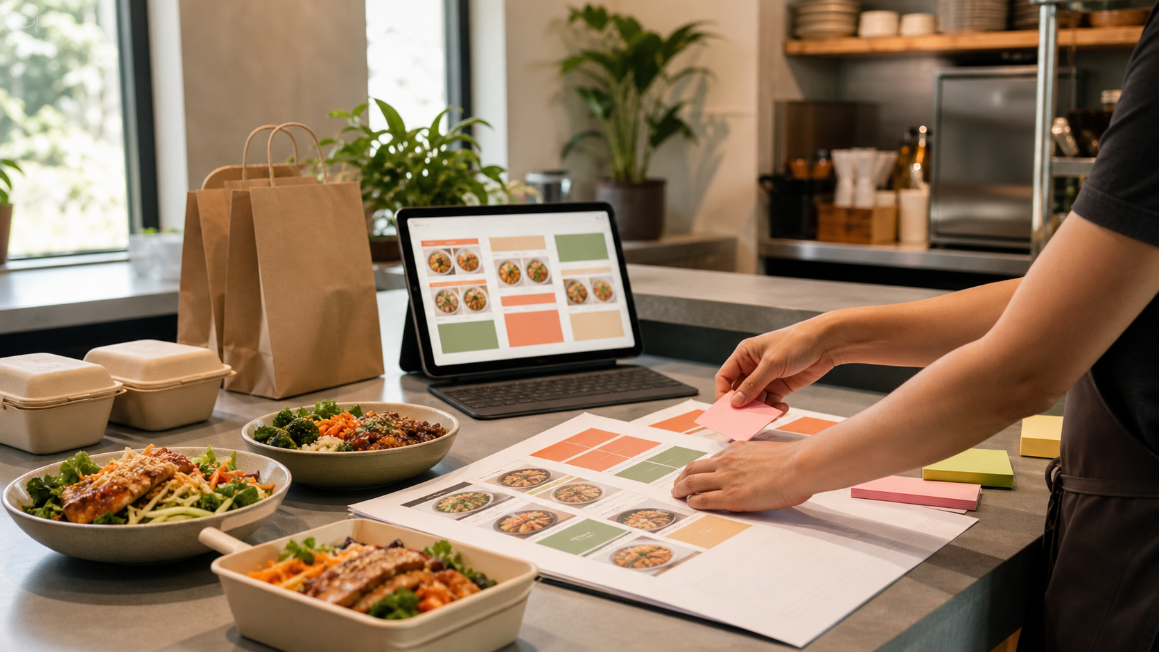
Use photos and item names to support the category logic
Categories do the first layer of sorting. Item names and photos do the next layer of decision-making.
If a category is called "Bowls," the item names inside it should help customers compare bowls quickly. Names like "Chicken Bowl," "Steak Bowl," and "Veggie Bowl" are plain, but they work. If every item has a clever branded name with no explanation, the customer has to open each item just to understand the basics.
Photos can help, especially for signature items, unfamiliar dishes, premium items, or family meals. They should not be used as a substitute for clear structure. A beautiful photo buried inside the wrong category still makes the customer hunt.
A practical pass is to look at each category and ask:
- do the item names make sense without staff explanation?
- do the first few items represent what this section is for?
- are the bestsellers easy to find?
- do photos clarify choices instead of decorating the page?
- are similar items close enough to compare?
For a deeper photo pass, read Restaurant Menu Photos for Online Ordering: What to Photograph First.
Do not let the print menu control the ordering page
The printed menu is not always the best blueprint for online ordering.
Print menus have space constraints, design columns, dine-in context, and server support. Online ordering has a different job: help a guest build a cart without help from the counter.
That means the online version can make practical changes:
- split a crowded print section into clearer online categories
- move online-only bundles closer to the top
- hide dine-in-only items from the ordering page
- separate catering from everyday ordering
- rename categories so mobile guests understand them faster
- keep seasonal items visible only while they are available
None of this changes the food. It changes the path to the food.
This is one reason OmNom's setup help matters. A restaurant should not have to turn menu launch into a full redesign project. The first version can be simple: clear categories, accurate items, readable modifiers, realistic hours, and a checkout path that works.
If you are preparing the whole menu for launch, pair this with Restaurant Online Ordering Menu Checklist: What to Fix Before Launch.
Review the menu after real orders come in
The best category structure is rarely perfect on day one.
After real orders start flowing, look for friction:
- customers calling because they cannot find an item
- popular items getting fewer online orders than expected
- staff seeing notes that should have been modifiers
- carts with drinks or sides missing more often than expected
- categories that almost nobody opens
- items that belong in a different buying moment
Those signals do not mean the online ordering page failed. They show where the menu can get easier.
Direct ordering is an owned channel, which means the restaurant can keep improving it instead of accepting a marketplace layout that may not match the operation. The more the menu reflects how guests actually order, the more useful that channel becomes.
Make the first version clear enough to launch
Restaurants do not need a perfect menu structure before they start taking direct orders.
They need a menu that guests can scan, staff can fulfill, and owners can improve as real behavior shows up. Clear categories are one of the simplest ways to get there because they affect every order before the guest ever reaches checkout.
OmNom can help restaurants set up that first direct ordering menu without charging a platform commission or monthly platform fee. Standard Stripe processing still applies. If your restaurant is ready to move more guests into an owned ordering path, start with OmNom or head straight to the restaurant app to begin.